.png)


Overview
NutrEAT is a mobile application designed to help people keep track of the food in their pantry and reduce food waste. The app allows users to input recipes, and when they cook them, the app automatically subtracts the items from the pantry. The problem NutrEAT aims to solve is the inefficiency of grocery shopping and the resulting food waste.
Company: NutrEAT
Role: UX designer
Status: Ongoing
My Role
User interviews
As a UX design intern at NutrEAT, I created intuitive and user-friendly designs for the mobile application. I helped with user research, wireframing, prototyping, and testing to ensure the app met user needs. I gathered feedback, analyzed data, and took the feedback and made improvements on my designs.
Usability testing
User flows
Wireframes
Web app design
Research
We also conducted 10 virtual interviews to gain more insight into people's goals and motivations while shopping for food.
Key Takeaways
1
People wanted to simplify and streamline their grocery shopping process
2
People often forgot what they had in their pantry and their food went to waste
3
People wanted to keep track of their pantry to be efficient with their money
Problem Statement
Users are struggling to efficiently manage their pantry inventory, plan their meals, and reduce food waste, which may result in frustration and inefficiency.
Proposed Solution
To improve the user experience of NutrEAT, we had to improve the onboarding process, and streamline the process to add a product.


User Personas

Jane Ivy
Motivation:
Reducing food waste and staying on-budget
Interests:
Gardening, couponing
Background:
Retiree in her late 60s

Michael Yo
Motivation:
Plan meals ahead
and save money
Interests:
Sustainability, art, cooking
Background:
College student
with a tight budget

Julie Adams
Motivation:
Waste less food
and save money
Interests:
Her dogs, hiking, coffee
Background:
Working professional
living alone
User Flow

Task Matrix
The NutrEAT app offers a variety of tasks that users can perform, and to make sure that the app is easy to navigate and use, the design team used a matrix to map out the necessary actions, input, and output for each task. This helped ensure that all of the app's key features were easily accessible and intuitive for users.

Journey Map: Sarah
We created a sample journey map for our user persona, Sarah.
We wanted to simulate what her experience using the app would
be like.

Design ideation
The colors for this application are bright and used to categorize the different nutrients.

Low fidelity wireframes
I created these wireframes after thoroughly analyzing the needs and pain points for the experience. These wireframes helped me determine the structure for the application and allowed me to start creating a seamless user experience.


Implementation
After determining colors and structure I began creating the first iteration of wireframes for the onboarding flow, and for adding a product.


User testing
Initiating the creation of high-fidelity wireframes and prototypes, I first prioritized validating my designs and guaranteeing their usability.
1
Interviews
To achieve this, we engaged six participants for in-depth interviews, and had them walk through the flows.
2
Surveys
We shared the mid-fidelity prototype with a group of participants, requesting that they complete a 20 question survey regarding their impressions.
Feedback implementation
There were three main changes implemented after the testing. Mostly related to how data was displayed and emphasizing some elements of the design.
Before

After

In the previous version it was difficult for users to understand the values on the chart. Adding markers on the X-axis was our solution for this, as well as formatting the bars vertically, which makes it easier to compare them.
After
Before


After
Before
I switched the onboarding process to be step-by-step instead of all-at-once. The first screen was not very popular with users. I added a progress bar at the top because users wanted to know how many steps were involved in onboarding.


I added icons for expiration date and amounts left in the pantry to add clarity to the values for each product.
Results and prototypes
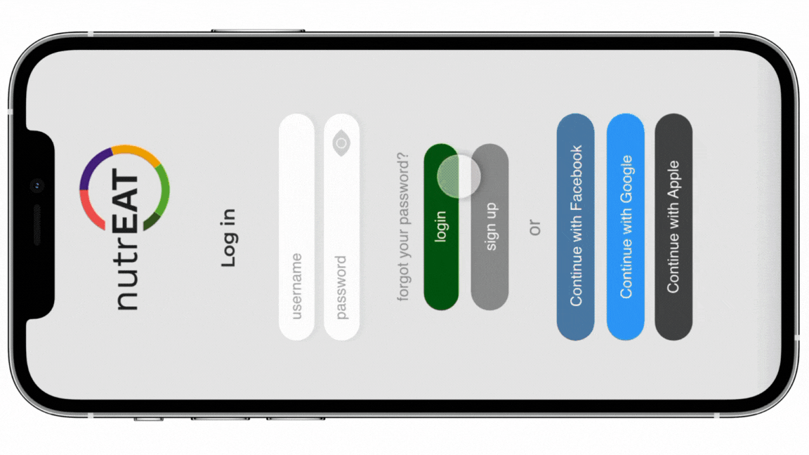
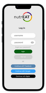
Onboarding process
This prototype shows the steps the user goes through to join NutrEAT.
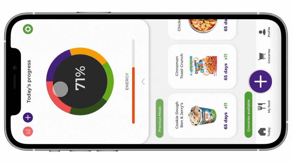
Adding a product
This screen sows the steps to add a product to your cart in the grocery store and then how it will display in your virtual patry.
Learning outcomes
During my time at NutrEAT, a startup focused on reducing food waste and improving grocery shopping efficiency, I honed my UX design skills while also experiencing the unique learning opportunities of a startup environment. I strengthened my abilities in user research, wireframing, prototyping, UI design, and measuring success through iterative feedback.
The fast-paced nature of the startup exposed me to effective collaboration, communication, and adaptability. The combination of hands-on design experience and the dynamic work atmosphere has equipped me with valuable skills and insights for future work.